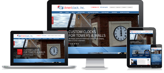
Responsive website design and development refers to the creation of a singular design structure that supports more than one device viewport (or in laymen’s terms, multiple screen sizes).
To put this into context, a fully responsive design adapts itself to large displays and to smartphone screens (as well as everything in between including laptop and tablets) in an effort to present a viewing experience that is tailored to a given screen size.
Traditional Website Interface Layout Approaches
Years ago when the majority of web traffic used desktops or laptops (before the age of tablets, phablets, and smartphones) websites could be designed with a fixed width and static objects without much regard to varying screen sizes. As display sizes increased, web designers adopted larger and larger standard widths for layouts until a few years ago when the proliferation of different traditional LCD sizes and the introduction of smartphones prompted the genesis of responsive design as we know it today. Add into the mix the first tablets (which several generations later now offer very high resolutions) and the need for responsive website design that displays well on many screen sizes is even more important.
Do I Need Responsive Website Design?
If your website does not lend itself to display well on mobile devices (even if you only choose to show basic content), you run the risk that a mobile visitor could leave and opt not to convert into a customer or a sale. When considering the addition of responsive website design to a new site or to your existing site, ask yourself the following questions:
- Do your customers use their smartphones or tablets to view your website or is it possible that they will in the future?
- Is it important to you that your viewers experience a high-quality experience on all devices including smartphones and tablets?
To avoid conjecture, take a look at your website’s analytics and look at several points in time. While every industry and market is different, you’ll likely see a rapidly advancing trend of usage by mobile/tablet visitors compared to traditional desktop visitors. Depending on the industry that you’re in and how new/existing customers find you, you may need to be concerned about responsive website design at this time but it’s a good trend to keep in mind the next time you redesign your website.
Mobile Site vs. Responsive Website
Google actually makes a distinction between a mobile site whose content does not reflect the content of a desktop experience and a responsive website. Mobile sites typically don’t redesign the user interface on the same page but rather present an entirely separate entity (that still targets mobile browsers to a certain degree). The problem is that mobile sites tend to only offer a fraction of the content of a responsive website. Take note that Pierre Far at Google even added a post about smartphone-optimized websites to the effect that it is advisable to go with a responsive approach when considering SEO implications on a website’s interface. You can be certain that if Google makes a point to address a topic like this, it is strongly advisable to pay close attention as there are likely going to be organic search engine optimization impacts at some point in the future which could make it worthwhile to consider for your current or new website. Make a St. Louis responsive website design part of your ongoing digital marketing strategy.
Retrofitting Your Website to Be Responsive
At IQComputing, we often see older websites in St. Louis and beyond that were designed years ago when “responsiveness” was not even a common term. In many cases we can take a legacy website and retrofit it, enabling its interface to adapt to smaller screen sizes without the use of third part detection services so that your visitors enjoy the experience of responsive website design even if you’re not ready to completely redesign your existing site. Responsive website design enables you to reach more devices (and in the end, more subscribers, potential customers, or even to better serve your existing customer base) as visitors use a wider and wider variety of screen sizes and mediums to browse your site. As the top St. Louis responsive website design company, we can target a range of devices or very specific view port sets that you define, enabling you to reach the largest number of screens possible.
Contact us to learn more about responsive web design.